When you encounter text with a line running through it, your brain instantly understands: something has changed. It’s a powerful, universally recognized visual cue. From crossing out an error on a paper to marking an original price in a digital storefront, strikethrough text communicates modification while preserving the initial context. It's a subtle yet effective way to prevent user uncertainty, showcasing a journey from 'this' to 'that' without completely erasing history.
However, for all its visual genius, strikethrough text introduces a significant blind spot when it comes to accessibility considerations for strikethrough text on screen readers. What's clear to the eye can be utterly invisible to assistive technologies, creating frustrating, confusing, or even critical gaps in information for users who rely on them.
This guide will dissect the unique challenges strikethrough text poses for accessibility, particularly with screen readers, and equip you with the knowledge and best practices to design and implement it inclusively. Because effective communication isn't truly effective unless it reaches everyone.
At a Glance: Key Takeaways for Strikethrough Accessibility
- Visually Clear, Auditorily Invisible: Screen readers typically do not announce strikethrough text, rendering its meaning inaccessible.
- Context Loss is Critical: Without explicit semantic cues, users relying on screen readers miss crucial information (e.g., a discounted price, a completed task).
- Semantic Over Visual: Prioritize HTML elements like
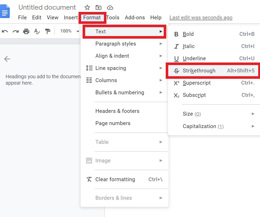
<del>and<ins>and ARIA attributes (e.g.,aria-label) to convey meaning. CSS styling alone isn't enough. - Pair with Explanatory Text: Always complement visual strikethrough with explicitly announced text, such as "original price," "completed," or "retracted."
- Test with Real Users & Tools: Regularly test your implementation with screen readers (like JAWS, NVDA, VoiceOver) and actual users to catch unforeseen issues.
The Silent Signal: What Strikethrough Text Does (and Why We Love It)
Before diving into accessibility, let's appreciate why strikethrough is such a prevalent and effective design tool. Its power lies in its ability to signify change while maintaining a vital link to the original state. Unlike simple deletion, which erases context entirely, strikethrough keeps the original element visible, allowing users to understand what was changed, not just that a change occurred.
Think about its cognitive function: we've all crossed out errors on paper. This convention translates seamlessly into digital interfaces, making it instantly recognizable.
Common Use Cases That Lean on Strikethrough's Clarity:
- E-commerce: "Was $90, now $30." The crossed-out
$90makes the discount immediately obvious and creates a sense of value. - Task Managers: A completed task with a line through it signals "done" without removing the task from view, offering a satisfying visual cue of progress.
- Messaging Apps: When a message is edited or retracted, strikethrough can show the original text, preserving conversational flow and transparency.
- Settings/Selection UIs: In a list of options, a deselected item might be struck through to indicate it's no longer active but still part of the available choices.
- Content Review & Collaboration: Editors marking proposed deletions in a document use strikethrough to suggest removal while allowing others to review the original wording.
In each scenario, strikethrough prevents user uncertainty. It leverages familiarity for its power, providing a clear visual signal of an altered status. While alternatives like dimming or blurring exist, they don't communicate invalidation or removal as directly as a decisive line through text.
Where Strikethrough Hits a Wall: Screen Readers and Semantic Meaning
Here's the critical juncture for accessibility: the elegance of visual strikethrough often fails entirely when encountered by a screen reader. Most screen readers do not announce the presence of strikethrough styling.
Imagine our e-commerce example: a user navigating with a screen reader encounters "$90 $30." Without any additional semantic information, the screen reader might simply announce, "ninety dollars thirty dollars." The crucial information—that $90 is the original price and is now crossed out because the new price is $30—is lost. This leads to confusion, misunderstanding, and a degraded user experience.
Similarly, a task marked with strikethrough in a to-do list might just be read as "buy groceries," even though visually it's clear the task is completed. The user misses the critical status update.
Why does this happen?
The root of the problem lies in the distinction between presentation (how something looks) and semantics (what something means). Strikethrough, when applied purely with CSS (e.g., text-decoration: line-through;), is a presentational style. Screen readers are primarily concerned with the semantic structure and content of a page, not decorative styling.
This challenge isn't unique to strikethrough. The principles extend to other common typographical styles:
- Avoid excessive italics and bold fonts: Screen readers generally don't announce these by default. Overuse for emphasis can lead to "emphasis fatigue" for visual users and hide critical information from non-visual users.
- Avoid using underline for emphasis: In the digital realm, an underline universally signifies a hyperlink. Using it for mere emphasis creates significant confusion and can mislead users into thinking something is clickable when it's not.
- Avoid all caps and small caps: These hinder readability for everyone, as they obscure word shapes. For screen reader users, all caps can sometimes be misinterpreted as acronyms, leading to incorrect pronunciation.
Why Semantics Matter More Than Style
To bridge the gap between visual design and screen reader interpretation, we must imbue our content with semantic meaning. This means using HTML and ARIA (Accessible Rich Internet Applications) attributes to explicitly state what a visual style implies.
For example, on the web:
- Instead of just
<b>or<i>(which are presentational for bold and italic), use<strong>for strong importance and<em>for semantic emphasis. Screen readers can be configured to announce<strong>and<em>differently, offering a potential auditory cue of emphasis, whereas<b>and<i>are purely decorative.
When it comes to strikethrough, we need similar semantic solutions.
Building Bridges: Making Strikethrough Accessible
The goal is to ensure that the information conveyed by visual strikethrough is equally accessible to users of screen readers. This requires a multi-layered approach, combining appropriate HTML, ARIA, and clear, explicit text.
The Web's Toolkit: <del> and <ins> Elements
For content that represents deletions and insertions, especially in legal documents, collaborative editing tools, or version control, HTML offers dedicated semantic elements:
- The
<del>element (for "deleted") indicates text that has been removed from a document. - The
<ins>element (for "inserted") indicates text that has been added.
By default, browsers usually render<del>with a strikethrough. Crucially, some screen readers can be configured to announce these elements, often stating "deleted text" or "inserted text" before reading the content. While not universally announced by default in all contexts, they provide a strong semantic hook that CSS-onlytext-decoration: line-through;lacks.
Example:
html
The original text read: This is the old, incorrect information. This is the new, correct information.
90 now 30
A screen reader would then announce: "Original price ninety dollars, now thirty." This is far clearer than "ninety now thirty." You can also use `aria-describedby` if the description is longer and needs to reference another element on the page, or if you want the visual text to be read *and then* the description. To make it even more accessible, you could consider a method to generate strike through text that's coupled with these semantic tags, ensuring consistency and proper implementation from the start. #### Context is King: Pairing Strikethrough with Explicit Cues Sometimes, the simplest solution is the best: directly stating the status in plain text that *will* be announced by a screen reader. This should always be considered, even when using `Buy groceries
But for accessibility, you need more: htmlBuy groceries
Or, even simpler for some contexts, especially when not tied to interactive elements: htmlCompleted: Buy groceries
In this case, the screen reader announces "Completed: Buy groceries." The visual strikethrough becomes a secondary, complementary cue for sighted users. The explicit "Completed" text provides the primary semantic meaning for everyone. **Key takeaway:** Always add semantic cues (e.g., ARIA labels, "completed" hints) as screen readers may not announce strikethrough alone. ### Beyond Strikethrough: General Typography Accessibility Principles That Apply While focusing on strikethrough, it's crucial to remember that it's just one piece of the larger typography accessibility puzzle. Here are broader best practices that underpin an inclusive text experience, many of which reinforce why semantic meaning is paramount: * **Choose Easy-to-Read Fonts:** Select fonts with clear, distinct characters, good height differences, and open counters (e.g., Source Sans Pro, Roboto, Noto Sans). Avoid overly decorative, thin, or compressed fonts that strain readability. * **Select an Appropriate Font Size:** Establish a minimum base font size (e.g., 16px for web content, 12pt for Word/PDF documents). Crucially, use relative sizing units (like `em` or `rem` on the web) to allow users to scale text to their preference without breaking the layout. * **Avoid Justified Text:** Justified paragraphs, where text aligns to both the left and right margins, create inconsistent and often large spaces between words ("rivers" of white space). This erratic spacing makes text difficult to read, particularly for users with cognitive disabilities, dyslexia, or those reading on smaller screens. Stick to left-aligned text for better readability. * **Consider Line Length:** Aim for an optimal line length of 50-120 characters per line. Lines that are too short make reading choppy, requiring frequent eye movements. Lines that are too long make it hard to track from the end of one line to the beginning of the next. On the web, use CSS to control column widths to achieve this range at normal window sizes. * **Judicious Use of Special Characters:** Ensure you're using the correct symbols for their meaning (e.g., `×` for multiplication, not `x`). Screen readers often interpret common keyboard characters differently than their specific symbolic counterparts, leading to miscommunication. ### Designing for All: A Checklist for Strikethrough Implementation When incorporating strikethrough into your UI, keep this checklist handy to ensure you're designing inclusively: 1. **Is it Necessary?** First, confirm that strikethrough is indeed the best visual cue for your context. Could a different approach (like hiding the old value and simply displaying the new, or using an icon) be clearer and simpler for everyone? Often, strikethrough shines when preserving context is key. 2. **Keep it Subtle (Visually):** The line itself should be light and not overpower the text. It should clearly indicate a strike without hindering the legibility of the underlying content for sighted users. Test different line thicknesses and vertical alignments for various fonts. 3. **Always Pair with Complementary Semantic Cues:** This is non-negotiable for accessibility. * For content deletions/insertions: Use `